Scatterplots
Interactive scatterplots are created interactively in EnlightenWeb. If several plots are created on the same page then they will be linked, meaning that if a selection is made in one plot, datapoints that are selected will be highlighted in the other plots.
To illustrate building your own scatterplot we will use the Arctic ABC Moorings and light observatory.
Starting with a blank page, click on a dataset in the Dataset List panel so that the variables are displayed. We can make a scatterplot by:
click on the scatterplot icon in one of the unused panels.
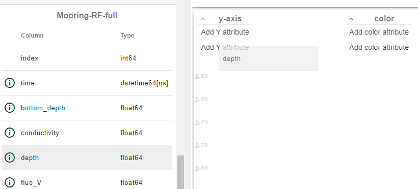
now drag one of the variables from the dataset panel in to the plot and release the mous button. The variable will be added to the X axis by default. In this example we choose “time”.
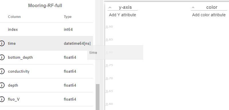
now drag the variable you want to measure over time, in this example we can use depth. When you drop this parameter in to the scatterplot panel it will be added to the Y-axis.
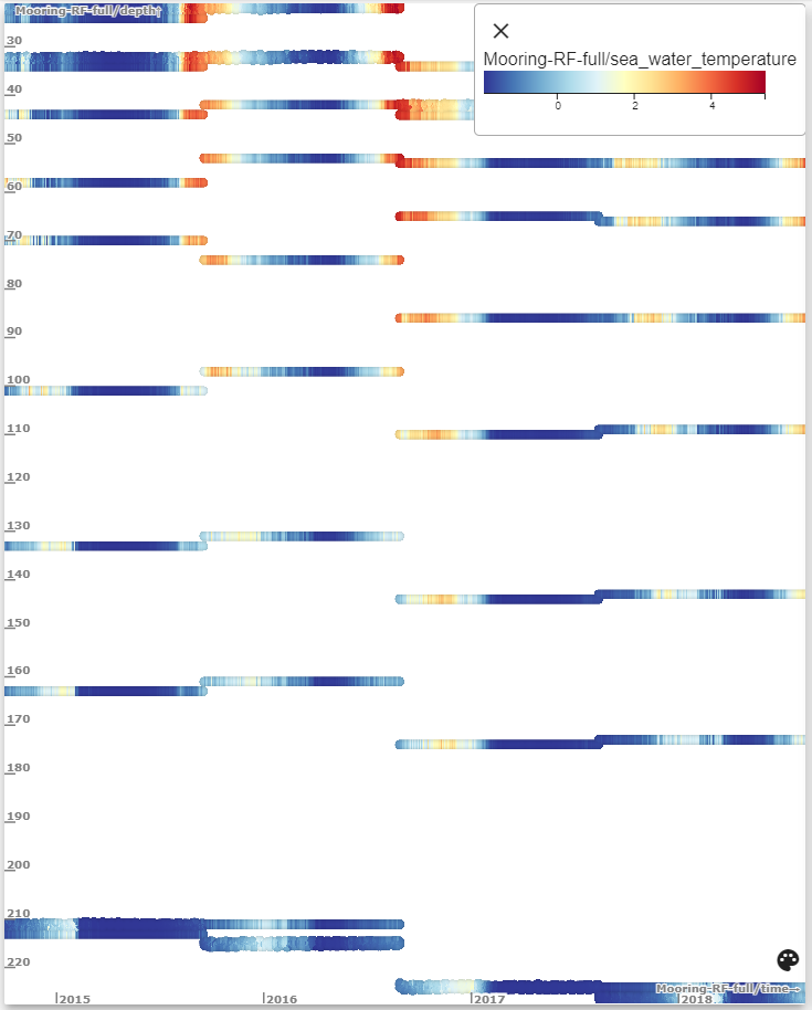
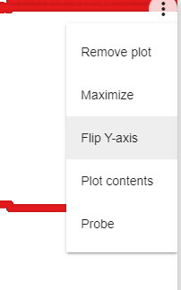
Notice that the data looks “upside down”. Increasing values of depth are going upwards, but because we are under the sea, it would be more convenient if increasing depth went downwards. In the context menu (3 dots) at the top of the plot, there is an option “Flip Y-axis”. You an choose this to reverse the Y-axis so that it looks more natural.
So far we only have a basic scatterplot. We see thousands of readings showing that there are measurements over time and depth but not much detail. If we are interested in temperature readings then we can add sea_water_temperature as a colour. To do this drag the variable sea_water_temperature over to the scatterplot. When we drop it it will automatically be added as a colour and we can see how the temperature develops over time by its colour.
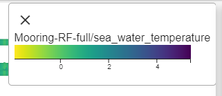
If we want to find out what the colour scale means and how the temperature is mapped to colour then clock on the “pallette” button

at the bottom of the plot. This opens up a pallette overlay that shows the colour band and the full range of temperatures shown. We can also change the colour pallette to something more meaningful - for example blue for the coldest temperatures and red for the warmest. To do this click on the colour band, you will then get an editor and can change from the default colormap of viridis to RdYlBu which ranges from blue to red with yellow in the middle.
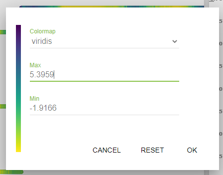
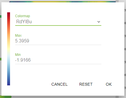
Press OK, and then “X” to close the colormap overlay.
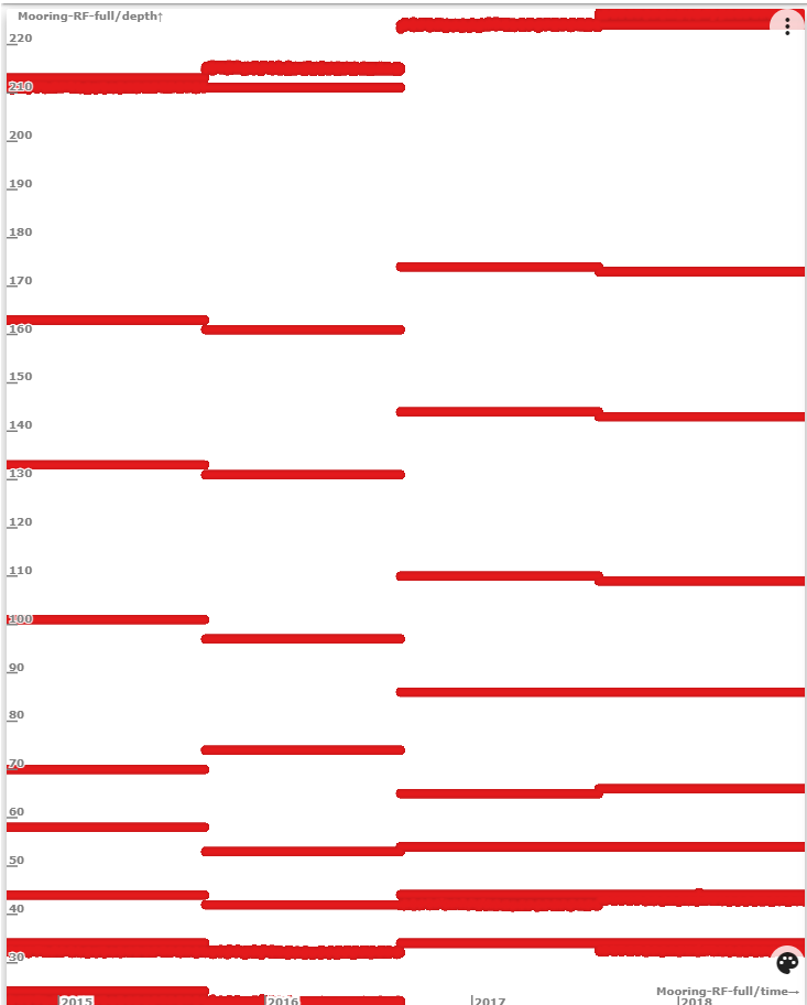
If you ever want to know what parameter is shown by the colour then you can simply click on the pallette button again and it wil show which parameters are represented by the colour scale.